1900's Rocket Racers

Alrightly, so I think it's my turn to pick the months theme...

The character for this month is a early 1900's racer. The idea is that this person (male or female) stylistically looks like they are a motor cycle racer from the early 1900's. The big historical difference is that the vehicles that are raced are a kind of turbine hover bike.

This character is of course part of a larger crew and racing team. So if you finish exploring the main character, you can expand on what his team members might look like, vehicles or settings (race tracks or maybe a garage where they work.)

I think i'm going to leave it at that... I have a lot of preconceived ideas, but i'll let each person fill in his or her own details. A good place to find some reference and learn a little history on motorcycle racing is at The Selvedge Yard. Specifically check out this post - Wall of Death & Indian Motorcycles

As a side note, it is not necessarily required to design the hover bike it's self, just the character.

Dasha


just crapped this one out... not a lot of work went into it.

The most difficult part about drawing Dasha was making her ugly. i kept wanting to smooth out lines and make her pretty. keeping the sketch lose and not caring help that though : )

Anyway on to the next theme!

Clay Ivan

And now a little somethin' for the fellas

Yalena
Dasha

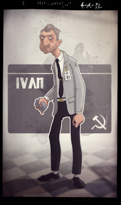
Ivan - Finished

Well, it took me a while to wrap this one up but I think it's done... (although I do keep finding things I'd like to tweak now...)

There are a ton of layers involved in this composed scene. The coloring in general wasn't really that complex. It's basically flat tones with hard shadows and a very light highlights layer on top.

This theme is coming to and end in just a few days! So, I think that's it for me. I'm brainstorming on next months theme now. Hopefully we'll all get to see some Russian character from our other members in the next few days


Update: In case anyone is interested, I made a quick run down of my coloring steps and posted them on my website mindsize.us . I don't go into any details but it does give a general overview into the process. I hope it's helpful to someone.

Vasili


Geek-out factor part 2

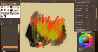
Been using the mypaint 0.9.0 beta for the last couple of days, I must say its quite nice. Its free, if you aren't so daring the .82 version is good as well, just not so refined. Just know, it's bare bones in some regards and very fast and powerful in others.

Ivan feedback


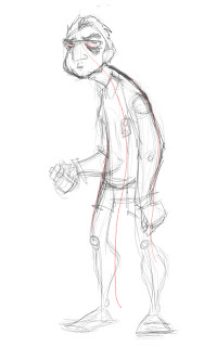
I actually like your initial gut sketch best- so I am starting here. Obviously the guy is a tad hungover, so I emphasized this a bit more (messy hair, eye-bags). I also simplified the curve of his body (in red) to bring a bit of smoothness to the form. Just my take as a dirty designer! (consider the bloodshot eyes a bonus!)

Ivan - Take 2

Alright so i took the ruff Ivan idea i drew last time and tried to give him a little more interest and style... Here is the process and what I have so far. I have more to do, but I thought i'd show my progress thus far.

This first image is the ruff body type I came up with. I did this sketch in photoshop on an 8.5 x 11 inch canvas at 300 dpi. In this case i used a 5pt round brush. Shape dynamic is set to pen pressure (so I can control the weight and size by the pressure of my hand.) I think i set the opacity to around 75%, just so the line didn't get too black either.

Once I had the body type, I started filling in the details and clothing. As I developed the details i would flip the image back and forth, tweaking proportion and making changes as I worked.
I find it far to difficult to get smooth clean lines digitaly. I'm much more comfortable cleaning up a sketch with a good ol' pencil. So when I was happy with the ruff, I printed out the image reduced to 20% opacity. As for the pencil I used to do the actual clean up, it was a Faber-Castell red colored pencil with a nice sharp point.
At this point I usually switch to a blue color pencil and go over the image one more time, to tighten the image up even more. In this case though, I rescanned my art and printed it again at 20% opacity. Because the reprinted line art is so light after printing it, i didn't need to use a different color and so just went over the image again with the red pencil. Otherwise the blue pencil and be easily separated from the ruff red pencil in photoshops channels.

This last image is fairly clean. I still need to go over it in photoshop to remove some dust and noisy pencil lines (you can see area like the hands are a little fuzzy.) So next is the digital cleanup and then comes the coloring...

Hope this explanation of my process is helpful. Let me know your thoughts.

Sergei

Just a small departure technique-wise, did line with pencil first, because doing lines digitally is a PITA. Still need to learn how to clean them up/separate them a bit better tho.

Ivan


Hey, Jay.

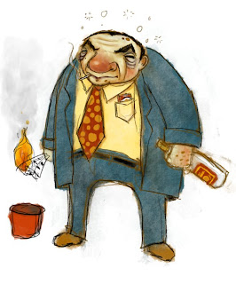
I like your Ivan drawing. I hope you don't mind, I took it into photoshop and drew over it. It started out with me just wanting to see how the bottle would fit into the dudes hand. In the end I ended up drawing the whole guy though. And actually I'm not sure if i'm even happy with the way the hand turned out. I drew that hand half a dozen times atleast. I was trying to give it a little more foreshortening, so the angle wouldn't look so awkward. Also the two exposed halves of the bottle, on the original, don't seem to line up. Something to keep in mind when drawing someone holding any object. It helps to start by ruffing in the whole shape and then drawing the hand around it.

Oh and another place the "draw though" would be on the coats bottom edge. You're guy either has it tucked into his pants or it has a big hole in it ; )

A few other key differences you'll notice between our drawings are in the shoulders and the dudes crotch. I just took what you had an added some underlying structure to it. Broadened the shoulders, bent the knees...

Anyway, i think your concept is really good! Don't take this post as me saying this is how you should have done it, I was just exploring and playing around. My drawing shows no more development to that character, just stylistic changes. Your original drawing gives this guy all the real personality and details.

keep it up! can't wait to see more.

Ivan

Here is the start of my take on Ivan. This is just a quick pass to get the character on paper. I'd like to go back and play more with body type and fine tune all the details.
As for the coloring, it's just light and dark for each surface, all done on one layer. ...and yeah, that's my color pallet to the right.
Thought it was cool to see Jay's working environment. So I've also taken a screen grab of mine. Nothing crazy here... just painting on a single layer set to multiply with a round brush. I set the brush "flow" to around 40%, 100% opacity, 75% "hardness".

Some Geek-out factor


Here is a screenie of my *recent* workflow, one that I like a lot. I try to keep it simple, as few layers as possible (the sketch one isn't really used), a limited palette (that I do modify a little) and only 3 brushes. I start off with a big block brush, getting the shape down, then go in with a pencil to define some things. Then I hit it with a block brush on the "paint" layer, followed by the "graphite shadow" brush on the "texture" layer (which upon further inspection doesn't exist! What the hell file did I start from? It's of course above paint yet below line. I am officially banned from software tutorials), then black pencil to define and color again to accent things; then back and forth like this maddeningly until something happens. The brush window shown isn't even used, but it rounded off the screencap nicely :) Also, sometimes I sketch preliminary ideas on paper, sometimes blocking in provides enough form to work from.

Edit: looks like blocking and paint are out of order! You guys get the hint. Also, I will probably delete the sketch layer. This is saved as a "default_char" file, so that all the layers are set up and ready to go for any new design.

Edit2: I can't stop. I use a USB numpad, that was like 10 bucks, that I map brush opacity/size, eraser, color picker, etc. to. This makes it nice when using a tablet- right hand on the pen, left doing the rest of brush control. GANGBUSTERS!

October Character Blast!

This month's theme: Cold War Soviet Russia (1950's-Early 80's)

I'm throwing these out there, because it has popped into my head.

Ivan: Government exec type, not totally corrupt but not a completely moral guy either. Obviously a drunk.

Dasha: Ivan's wife, high maintenance , reeks of perfume, is still a bit of a looker at late 40's early 50's- but is a bit disgusted with her husband at this point.

Yalena: Ivan's mistress, old country, in her 40's, but from fine farm stock, a plump, hard lived Siberian Gal- yet not bitter, loves life.

Sergei: Soldier in his late 20's, a bit naive but loyal, tho still a slave to his morals. Clean cut.

Olaf: Orphan kid, Gung-ho military- wants to be a soldier when he grows up. Scrappy life on the street.

Alexandr: yes there is no "e." Brute robot- powerful, military, yet not malicious. Big SOB. Design: think space program, migs, russian cameras, etc.

Vasili: The guy who made Alexandr. I picture the guy who invented the ak-47, working for Commies was not a glamorous thing, the ak-47 guy lives in a crap apartment altho having invented the most popular assault rifle in the world. Think late 50's- EDIT: Late 50's to 80's and above, end EDIT:, smart as hell but rode hard and put away wet.

Don't know where this blog is at, but here are some characters in a little world, feel free to use them or not! Happy drawing!

I guess it would be a good idea to tag posts from this theme as "Russian, Cold War" I think tagging is wise to keep consistent for future reference.